The other day, my coworker asked me, “Do you think about the label at all when buying drinks?” The question made me laugh, because not only has art helped convince me to buy a beer, but I’ve bought cans JUST for the art — even beer I strongly suspect I won’t like — and I’m sure you have too.
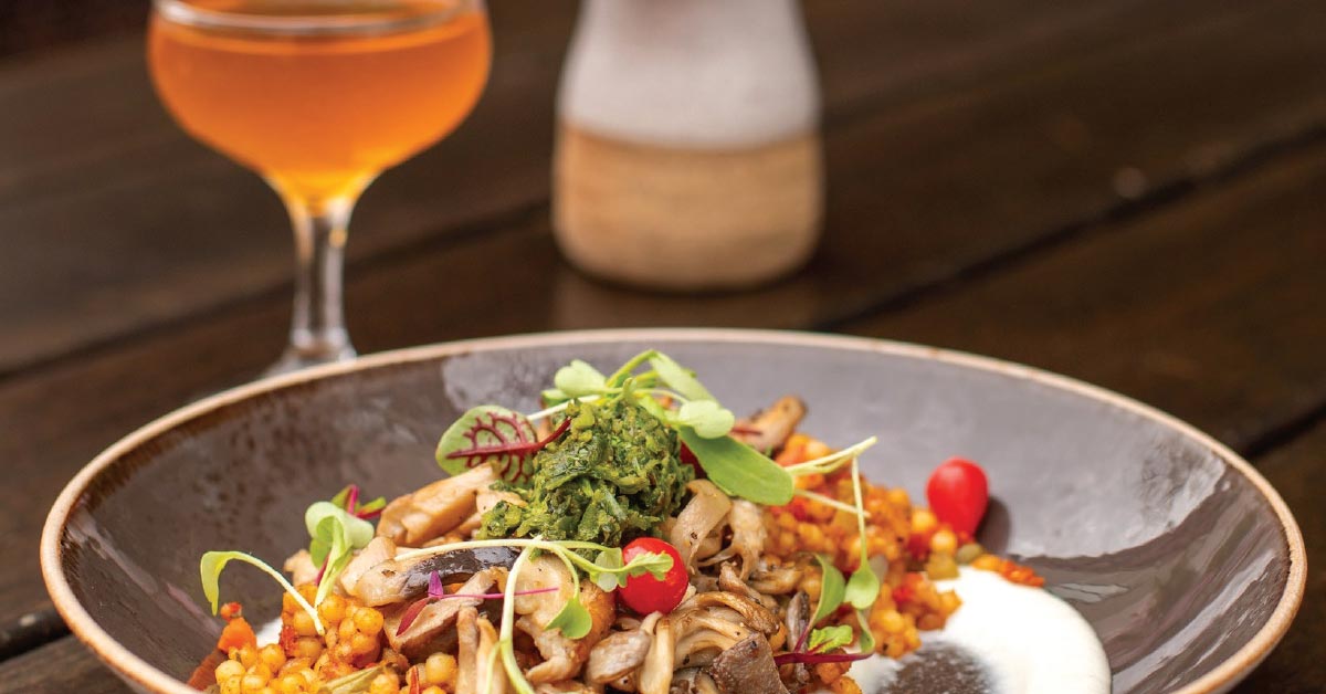
There’s something special about looking down at that beautiful art every time you take a sip, connecting the visual creativity to the liquid itself. Great chefs say we eat first with our eyes, and beer is no different, whether it’s a beautiful pour in a glass or right out of the can.
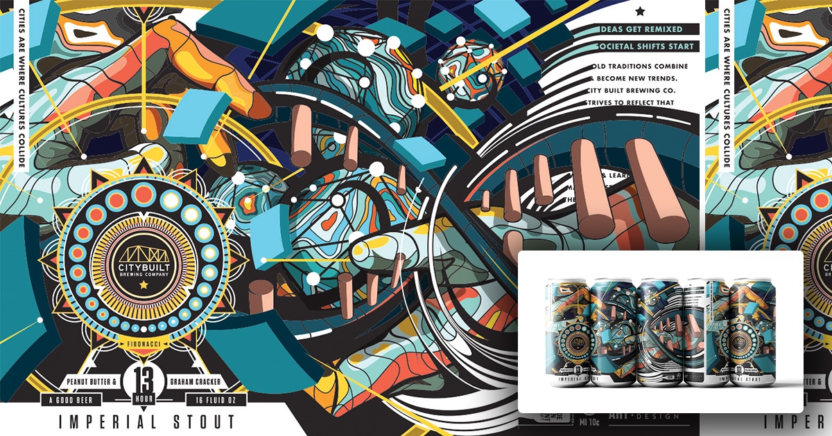
Here in West Michigan, we have multiple local breweries with fantastic art and beer to match. One spot leading the charge is City Built Brewing, with their Prague Underground label winning Best Beer Label in USA Today.
City Built’s eye-catching labels are designed primarily by local artist Kyle DeGroff, with assistance from artist Elliot Chaltry — who also works with BarFly — and input from owner Ed Collazo.
While City Built’s cans were always nice, they were initially a mix of simplistic patterns and a bit of art, overall feeling minimalist. Near the end of 2019, however, City Built began work on some changes to the beer, which provided the perfect opportunity to launch a new aesthetic.
“We happened to start making beer that I was really excited about, we happened to develop a really good relationship with DeGroff Design, and then we happened to have a pandemic that made Elliot available,” Collazo said.
DeGroff’s signature style employs a kaleidoscope of colors, patterns and shapes, while still creating a clear image that’s recognizable from a distance. It’s eye-catching to those who’ve never seen it, and memorable to those who have.
You may have also noticed that City Built’s cans have a sense of depth, both to the eye and to the touch. That’s in-part thanks to Middleton Printing, who employ a process layering the ink and creating a sort of glossy “varnish” that catches the light. As a sidenote, Middleton also assists in putting functional braille on all of Broad Leaf Brewing’s cans.
Collazo likes to work with the artist to create beer series with cohesive art across each can, such as the Fibonacci Sequence. While Collazo had an idea for a stout brewed at multiple different boiling times, primarily as an experiment, DeGroff was briefly down the numerology rabbit hole, creating the perfect recipe (literally) for a new beer series. The stouts were boiled at three hours, then five hours, then 13, and 21 hours.
While the owner does help with ideas, he’s never once had to turn down the art presented to him by DeGroff and/or Chaltry. Next year, he hopes to bring another artist in the mix for an IPA series, yet again providing a cohesive look across cans.
West Michigan is known for both beer and art, so it only makes since they’d come together so strongly here. Collazo and City Built want to create a great sense of community, and that’s exactly what they’re doing here.
“I appreciate the relationships that we’ve built with our artists,” Collazo said. “And you know, they’re cool people to hang out with and we have tons of them in Grand Rapids, so for me, selfishly, I enjoy it because they’re fun people to be around.
Cool Beer, Hot Art
We asked other breweries around West Michigan to send us some of their favorite labels and the thought process behind them.
Short’s Brewing:
Melt My Brain
Our brewing, sales, and marketing team work collaboratively to concept and develop art direction for each beer — lots of inside jokes and cultural references. We work with a local illustrator (Hi Aunt Tanya!) to execute our vision. She used to do everything in colored pencil, and now draws digitally. This specific art has evolved over time to include one of our very own staff, with our regional sales director Kerry Lynch on the label — we even recently redid the art for a more zenned out/less screamy vibe for a new indica gummy of the same name we’re releasing with Jolly Edibles.
Speciation Cellars: Neontology
At Speciation, most of our art is drawn by the very talented @art_by_graves (Dave McKie). We pick an ecosystem to focus on each year, and 2021 is sea life! So, most of our illustrations are of various funky aquatic creatures!
Grand Rapids Brewing Co.
At Grand Rapids Brewing Company, we approach our beer bottle program with a heritage aesthetic using local screen printers. We position typography at the forefront and add complementary design elements, with the help of Creative Manager Elliot Chaltry.
Broad Leaf Brewery:
Space Queen Origins
We’ve tried to keep art at the forefront of what we do at Broad Leaf. A lot of our themes (cult movies, space exploration, planet building, alien flora and fauna) already lead to more vibrant and interesting art and storytelling. The art is done by myself or any number of much more talented local artists. Michelle Thibodeau did our label for a beer called Space Queen: Origins. The Space Queen beers are released under the banner of both Vivant and Broad Leaf since they are a bridge between the two taprooms. The series of beers started at Vivant and put us on a path that would eventually influence a lot of what Broad Leaf is about.
Also, one of the things we’re most pleased about at Broad Leaf is that we’ve been working with local printing company Middleton Printing to put braille onto our cans!
Odd Side Ales
I (Jay Ross) have had the honor of designing every label in the history of Odd Side Ales. My process can’t start without a beer name. Every employee is encouraged to participate in the naming and concept process. Once the decision is made, I can only wait for the imagery to pop into my head.